UNDERGRADUATE WORK
LIBERTY UNIVERSITY, SPRING 2019
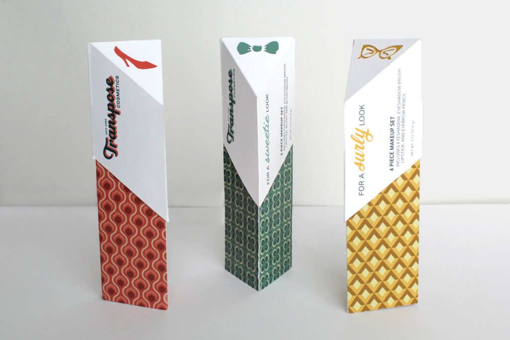
This makeup packaging design is inspired by my top three doctors from BBC’s Doctor Who. The color scheme and patterns were based on designs from the sixties because that’s when the show first aired.
The Doctor does not die in this television series, but “regenerates” and changes actors while still being the same character, having the same memories and experiences. I chose the main personality trait of my three favorite Doctors to create “moods” of makeup sets: sassy, sweetie, and surly.
The brand name, Transpose Cosmetics, is a musical reference. When a song is transposed it is the same song just in a different key, just like the Doctor is the same character even when it’s played by different actors. I chose makeup product packaging because you can use it to change your face, just like how the Doctor regenerates and changes his face.
The patterns were created in Adobe Illustrator, and the logos for each set were modified to match the color scheme. Each set has its own icon that is an additional reference to each Doctor.


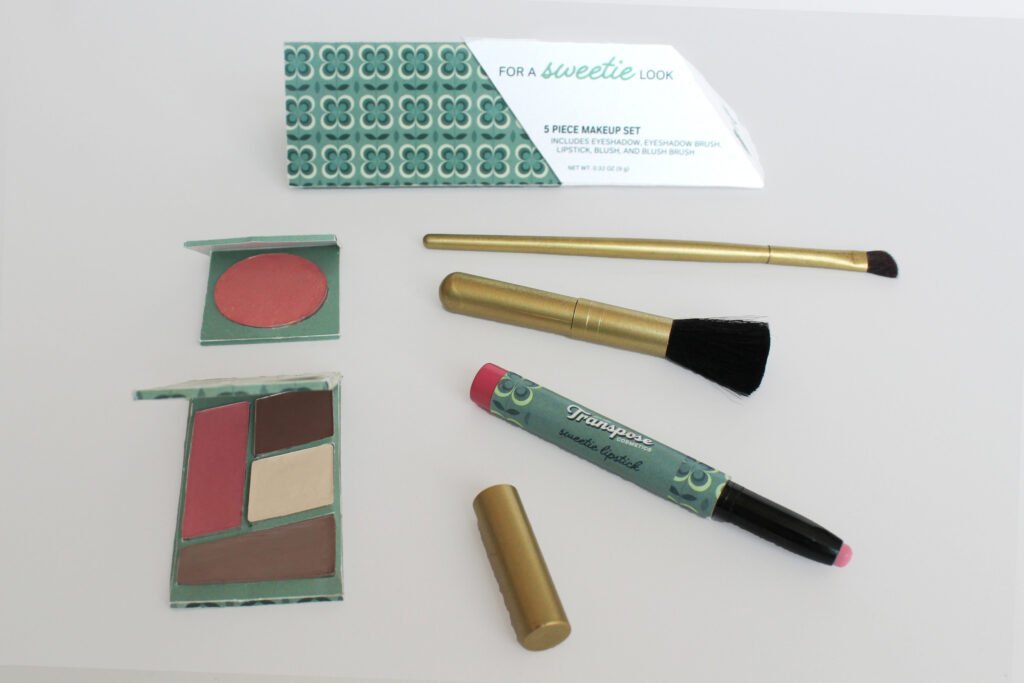
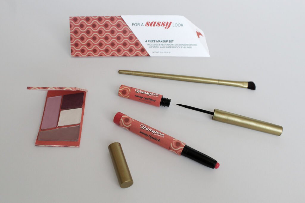
Once the cap is removed, the makeup set opens up and is almost “bigger on the inside” which is a reference to a popular phrase used in the show. Each set has a mirror attached, a small eyeshadow palette, eyeshadow brush, lipstick, and another item that is unique to each Doctor/set.


